Continuing with the 10 Common Interior
Design Mistakes,
White Hat Architecture suggests that when hiring a
professional in the field questions should be asked, it is normal to be unclear
about a sketch or floor plan, but everything takes time, do not feel pressured
and resolve your doubts before making a decision. This is the second part of
the 10 Common Interior Design Mistakes post:
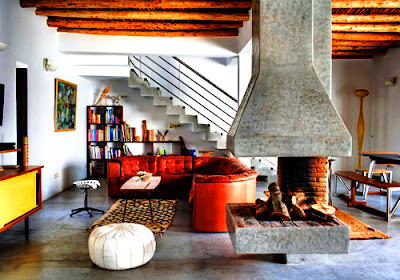
- Not having a focal point.- If attention is desired on a specific item
or area, a focal point can be useful. It is important to determine what will be
shown to other people, it could be an artistic picture, a fireplace or a
panoramic view. White Hat Architecture suggests to have more than one focal
point but to maintain a balance.
 |
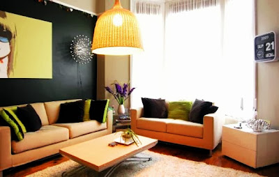
| Artistic Picture as a Focal Point |
 |
| Fireplace as a Focal Point |
- Not allowing enough time for the design process.-Everything requieres
time and planning, White Hat Architecture suggests not attempt to improvise and
skip processes because this can be more costly and time consuming.
- Getting furniture without first checking room dimensions.- It is
relevant to know the dimensions of the space where the furniture will be
located to avoid that the room looks out of scale.
- Colour co-ordination- The best way to keep the balance in a room is by
using patterns, which provide a theme for the project. It is better to choose
three colours in a room; a dominant colour used for the walls, a second colour
used for furniture and accessories, and a third colour to enhance a particular object.
- Failure to connect indoors with outdoors.- Having a design plan can
help achieve a connection between an indoors and outdoors project; for small
homes, the patio is the best place to enjoy the summer days, and by providing an
outdoor view it will mesh perfectly with the interior space.
 |
| Connect Indoors with Outdoors |
If you want to read the first part click
here.


No comments:
Post a Comment