Monday 30 September 2013

Gardens by the Bay Master Plan (First Part)


White Hat Architecture believes that taking into account the architecture and philosophy into the direccion of the use and  knowledge of materials, a confined relationship between the  sketch and the client is established, starting since the first stages of the project.


Master Plan View via blog White Hat Architecture
Master Plan View

This is how the firm Wilkinson Eyre Architects is incorporated into the development for Marina Bay´s master plan and shows us their concern about sustainable development, taking as a platform for development the creation of a green complex where we are shown how to take advantage of environmental resources and the style to design unusual spaces, transforming the vegetation into something more atractive for the architecture. Taking advantage of the Project; the culture built by Singapur around the sustentability, horticulture and artistic garden;  it is shown to the World what Singapore´s people maintain as a living style, culture and society inside this complex,even the deepest corners where we can explore an environment similar to that in a mediterranean place or changing to a more tropical place.


Gardens by the Bay Map view via blog White Hat Architecture
Gardens by the Bay Map View

The Project has four elements to distinguish: The flower Dome, The Cloud Forest, Supertree Grove, The Dragonfly and Kingfisher Lake. The first two  architectonic elements are the most striking and complex that one can see, where most of the environmental reserve was developed and which had more architectonic attention for its development. Considered as the biggest Greenhouses without columns in the world, the architectonic elements Flower Dome and Cloud Forest achieve the majority of the catchment of freshwater and sunlight that subsequently can be reused and transformed into energy, given that the main characteristic they have is to keep a humid and warm weather for the growth of the diferents plants that are kept in the interior.
Garden by the Bay via blog White Hat Architecture
Gardens by the Bay Sky View

The Flower Dome and Cloud Forest design required the use of more than 16 000m2 of glass, which was  split in a repetitive pattern to facilitate its maintenance as well as to take advantage of sunlight, wrapped in a steel net that acts like an eggshell, moreover there exists a sail roll installed in the steel structures that are sensitive to sunlight, these activate in the sunnier days to generate shadow reducing by 65% the incident of sunlight, avoiding the greenhouse effect.

Flower Dome via blog White Hat Architecture
Flower Dome 

White Hat Architecture suggests reading Gardens by the Bay Master Plan (Second Part) to learn more about The Flower Dome and the rest of the project.


Follow us on Twitter @WH_Architecture

Flower Dome image source: www.jacquelineong.com 

Thursday 26 September 2013

10 of the Most Common Interior Design Mistakes (Second Part)


Continuing with the 10 Common Interior Design Mistakes, White Hat Architecture suggests that when hiring a professional in the field questions should be asked, it is normal to be unclear about a sketch or floor plan, but everything takes time, do not feel pressured and resolve your doubts before making a decision. This is the second part of the 10 Common Interior Design Mistakes post:

  •               Not having a focal point.- If attention is desired on a specific item or area, a focal point can be useful. It is important to determine what will be shown to other people, it could be an artistic picture, a fireplace or a panoramic view. White Hat Architecture suggests to have more than one focal point but to maintain a  balance.

Artistic Picture as a focal point via blog White Hat Architecture
Artistic Picture as a Focal Point 
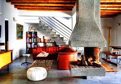
Fireplace as a Focal Point via blog White Hat Architecture
Fireplace as a Focal Point
  •        Not allowing enough time for the design process.-Everything requieres time and planning, White Hat Architecture suggests not attempt to improvise and skip processes because this can be more costly and time consuming.
  •       Getting furniture without first checking room dimensions.- It is relevant to know the dimensions of the space where the furniture will be located to avoid that the room looks out of scale. 
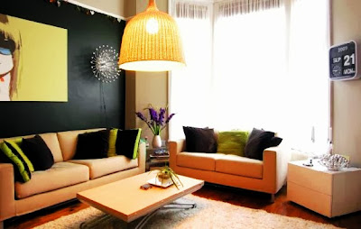
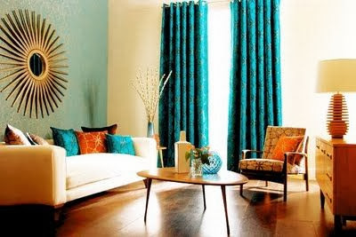
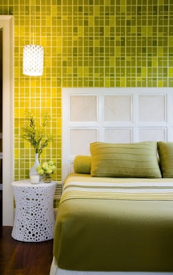
  •                   Colour co-ordination- The best way to keep the balance in a room is by using patterns, which provide a theme for the project. It is better to choose three colours in a room; a dominant colour used for the walls, a second colour used for furniture and accessories, and a third colour  to enhance a particular object.

Green Colour Co-ordination via blog White Hat Architecture
Green Colour Co-ordination
  •                      Failure to connect indoors with outdoors.- Having a design plan can help achieve a connection between an indoors and outdoors project; for small homes, the patio is the best place to enjoy the summer days, and by providing an outdoor view it will mesh perfectly with the interior space.
Connect Indoors with Outdoors via blog White Hat Architecture
Connect Indoors with Outdoors
If you want to read the first part click here.


Follow us on Twitter @WH_Architecture


Wednesday 25 September 2013

Casas sustentables para estudiantes


Diseñado por Tengbom Architects y con tan solo 10m2 de espacio construido, ubicado en Virserum y Lund Suecia, este proyecto inteligente y sustentable podría ser la solución a muchos de Los problemas que enfrenta una institución publica o privada, que ofrece la oportunidad de tener dormitorios como alternativa para estudiantes foráneos y que no cuenta con el espacio suficiente para albergar a una población estudiantil grande.

Desarrollo del concepto via blog White Hat Architecture
Desarrollo del Concepto
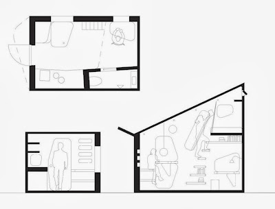
Casas sustentables para estudiantes via blog White Hat Architecture
Planta y Corte del Proyecto

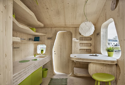
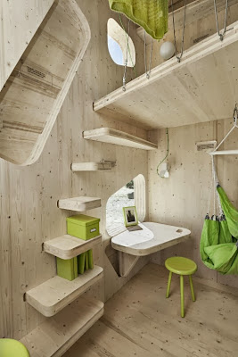
Para el diseño de estas unidades se consulto a un grupo de estudiantes discutiendo a cerca de sus necesidades o preferencias. De acuerdo con esto cada unidad fue diseñada para que un estudiante pueda sentirse como en casa, pequeñas son las unidades pero acogedoras, se encuentran equipadas con cocina, baño y un pequeño loft donde podrán descansar además acorde con la sustentabilidad del proyecto este cuenta con un pequeño jardín y un patio.

Vista exterior del proyecto via blog White Hat Architecture
Vista Exterior del Proyecto
Vista interior del proyecto via blog White Hat Architecture
Vista Interior del Proyecto

Vista interior del proyecto via blog White Hat Architecture
Vista interior del Proyecto


Este proyecto es todo un experimento, en el cual se obtuvo un permiso especial para poder reducir el espacio de 25 m2 a solo 10m2 de construcción; la proyección que se tiene con esta reducción en la construcción, es que el estudiante pueda reducir el Costo de la renta de un estudio o apartamento hasta un 50%. Usando como materia prima madera laminada de producción local, logran una reducción muy alta en el impacto ambiental y en las emisiones de carbono; incluyendo la manufactura de la madera a través de la compañía Martinsons logran desarrollar una técnica de ensamblaje que reduce el tiempo de construcción en sitio; contemplando la construcción de 22 unidades para su inicio.

White Hat Architecture considera esta como una palpable solución, que puede ser proyectada no solo como unidades estudiantiles, sino también como viviendas temporales en zonas de desastre, donde hay que cubrir lo mas rápido posible necesidades básicas como un hogar.


Síguenos en Twitter @WH_Architecture
Fuente de las imágenes fotógrafo Bertil Hertzberg


Monday 23 September 2013

10 of the Most Common Interior Design Mistakes (First Part)


Described as part of an effective setting for a range of human activities, interior design is taking a fundamental part in people´s everyday lives; but when one does not have much experience in the field, common mistakes  can be made. It is for this reason that here, we enumerate the most common mistakes so that your design can look as if it was made by a professional.

  •       Select furniture before chosing your paint colours- It is likely that a lack of satisfaction with the colour of the walls will tend to incline the inhabitant to wish to change the furniture, but this can be more costly and time consuming. Therefore, White Hat Architecture recommends making a plan to choose the colour of the furniture prior to selecting the paint colour for the walls, this way, it will be easier to get the combination desired.
Choose the colour of the furniture first as walls can be changed via blog White Hat Architecture
Choose the colour of the furniture first as walls can be changed
  •        Do not over-furnish a room- It is easy to go from a well furnished and spaciously designed room to a collection of furniture and unnecessary items. Within interior design, less is more; choosing furniture according to needs can be an excelent rule, although the rest might seem indispensable, it is important to remember that more furniture will cause a room to look smaller.

Over-furnished room. Common Interior Design Mistakes
Over-furnished room
  •                       Do not be a victim of poor lighting- Lighting is the most important element of interior design, allowing a space to have more natural will increase its liveliness; White Hat Architecture recommends that you choose the proper lighting for each room according to the activities that take place there.

Good Lighting  via blog White Hat Architecture
Good Lighting 
  •                   Do not hide your windows.- Hanging curtain rods is very important because this will determine how the space will look. If the rods are hung close to the ceiling, it will give the space height and more natural light.
  •             Do not move your furniture against the walls.- This is a common mistake, the best way is by keeping some distance between the furniture and the walls, to obtain a more cosy space where closer interaction with other people can occur.
If you want to see the second part click here.

Follow us on Twitter @WH_Architecture

Wednesday 18 September 2013

The Endless Stair


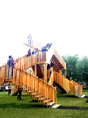
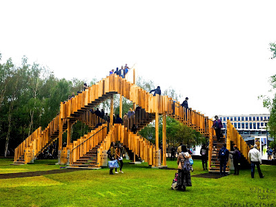
The Endless Stair se inspiro en un sketch hecho por dRMM Architects y Arup engineers. El proyecto nos muestra como la sustentabilidad esta trabajando en la construcción, tomando un rol de alta calidad para el futuro de la industria.

The Endless Stair diseño para el London Design Festival. White Hat Architecture
Vista del Tate Modern desde The Endless Stair


The Endless Stair diseño para el London Design Festival. White Hat Architecture
Vista Posterior The Endless Stair


El material que se uso en este proyecto es parte del camino hacia la sustentabilidad, usando madera dura de bosques que se regeneran de manera natural y provenientes de Estados Unidos, siendo este el mayor productor en America de madera dura. Como resultado de esta sustentabilidad se usan paneles de CTL ( madera laminada cruzada) para crear muros y pisos mediante simples procesos de construcción. Las cualidades de los paneles CTL son estabilidad y fuerza equilibrada en todas direcciones, son muy útiles en espacios abiertos o cerrados como resultado de estas cualidades, se fijan en 197 piezas en forma de “L”.
The Endless Stair diseño para el London Design Festival. White Hat Architecture
Vista Posterior Completa The Endless Stair

The Endless Stair diseño para el London Design Festival. White Hat Architecture
Vista Lateral The Endless Stair


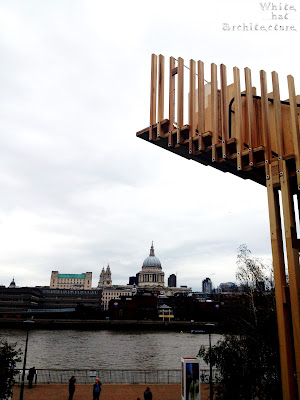
The Endless Stair esta soportada por columnas de madera de tulipán, que son suficientemente fuertes para su propio peso, The Endless Stair es mas delgada que los paneles de madera suave. The Endless Stair es el proyecto de paisaje para el London Design Festival 2013, organizado por el Tate Modern y esta ubicado en el pasto que esta enfrente de la galería, White Hat Architecture estuvo ahí explorando la estructura para traerte estas impresionantes vistas a través del río Thames. 


The Endless Stair diseño para el London Design Festival. White Hat Architecture
Vista de St Paul´s Cathedral 


Síguenos en Twitter @WH_Architecture

Tuesday 17 September 2013

The Endless Stair (English)


Inspired by the drawing of dRMM Architects and Arup engineers, this project was started.This landmark project shows us how sustainability is working in construction, taking its role as a high quality feature for the future of construction.


The Endless Stair diseño para el London Design Festival. White Hat Architecture
Back View of The Endless Stair
The Endless Stair diseño para el London Design Festival. White Hat Architecture
St Paul´s Cathedral View

The material for this project follows the path of sustainability, therefore they used American hardwoods which grow in managed natural forests and regenerate naturally, because of this America is the world´s largest producer of hardwood. As a result of this sustainability they used  CLT (cross laminated timber) panels for Endless Stair to create walls and floors with a simple construction process. The qualities of CLT are stability and equal strength in all directions, as a result of these qualities it is very useful in close and open spaces, the pieces are fixed onto 194 complete “L” components.


The Endless Stair diseño para el London Design Festival. White Hat Architecture
Full View of The Endless Stair

The Endless Stair diseño para el London Design Festival. White Hat Architecture
 View of The Tate Modern from The Endless Stair
The Endless Stair is supported by tulipwood columns, which are strong enough  for its weight, therefore, The Endless Stair is much thinner than the usual softwood panels. The Endless Stair is the Landmark Project for London Design Festival 2013, hosted by Tate Modern and located on the lawn infront of the gallery, White Hat Architecture was there to explore the structure and to bring you these stunning views along the River Thames.
The Endless Stair diseño para el London Design Festival. White Hat Architecture
Back View of The Endless Stair

Monday 16 September 2013

La sensación del color en el diseño interior


La sensación resultante de la estimulación de la retina del ojo por ondas lumínicas resulta ser el color, el cual nos produce una reacción inconciente actuando como un código que nos informa que cada fragmento tiene un uso especifico.

En White Hat Architecture consideramos que el uso del color es tan divertido como lo es cambiar de look personal, en un principio no sabes por donde comenzar pero al final te enorgullece haber dado ese paso a la aventura del color.

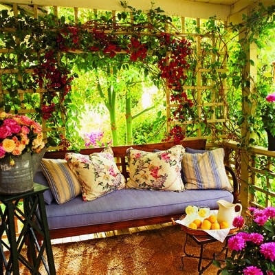
Terraza de color. Imagen en blog de  White Hat Architecture
El color revitaliza el diseño de un espacio, como una terraza.
El color es una herramienta que determina el tema de nuestra decoración y que nos va guiando a través del amplio mundo de los contrastes y matices que existen en la naturaleza y que vemos reflejados en la arquitectura. Saber que tenemos 3 colores principales en nuestro circulo cromático, el amarillo, el rojo y el azul nos hace conocer las variantes que podemos tomar en nuestra elección del color que queramos usar para nuestro proyecto; la manera mas sencilla es en la cual se elige un solo color pero en diferentes tonalidades, esto hace la apariencia mas monocromática, teniendo la oportunidad de usar mas de 3 colores sin llegar a perder la armonía en el proyecto. La siguiente opción que en White Hat Architecture planteamos es la armonía del color, con lo cual tendremos que tener mas cuidado en su elección, con esto nos referimos a usar como segundo color el que este junto dentro del circulo cromático al primero de nuestra elección, diversas tonalidades de verde, turquesa y azul o naranjas, amarillos y verde o algo mas atrevido con un azul y violeta; el secreto esta en utilizar diversas tonalidades frías con cálidas.

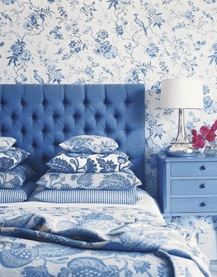
Apariencia monocromática Imagen en blog de White Hat Architecture
Apariencia monocromática
Armonía del color Imagen en blog de White Hat Architecture
Armonía del Color
White Hat Architecture recomienda no mezclar colores calidos con cálidos o fríos con fríos ya que estos se eliminaran por completo y no darán el resultado que estamos esperando. Y por ultimo, la siguiente opción para White Hat Architecture es el uso complementario de los colores; entiéndase de la manera mas sencilla como usar el color opuesto al que queramos, pensemos que nuestro primer color es el rojo, teniendo naturalmente el verde como complemento al que sencillamente lo podemos percibir en una manzana; este mismo utilízalo para darle realce a algún objeto que quieras en particular y recuerda usar algún color neutro para mantener esa armonía que queremos en nuestro proyecto reflejar. Ahora solamente tienes que elegir cual dominara mas tu proyecto, intenta haciendo pruebas en cartulinas que puedas comparar y que se puedan  colocar de manera sencilla en los muros, para poder observar a lo largo del día y entender como  afecta la luz natural a tu diseño y como lo puedes mejorar, evita hacerlo directamente en los muros de tu proyecto.

Colores Complementarios Imagen en blog de White Hat Architecture
Colores Complementarios
Sin que se vuelva una contrariedad, White Hat Architecture te invita a perder el miedo decorando tu propia casa y divertirte en el intento.

Síguenos en Twitter @WH_Architecture